Are options market makers too optimistic
November 17, 2022
Headline indices corrected on Wednesday with the NDX losing around 1.45% and the SPX dropping 0.8%. The level we have been highlighting over the past few weeks defined by the upper bound of the downtrend seen in 2022 has so far played a role in slowing the move higher as seen on the below chart.
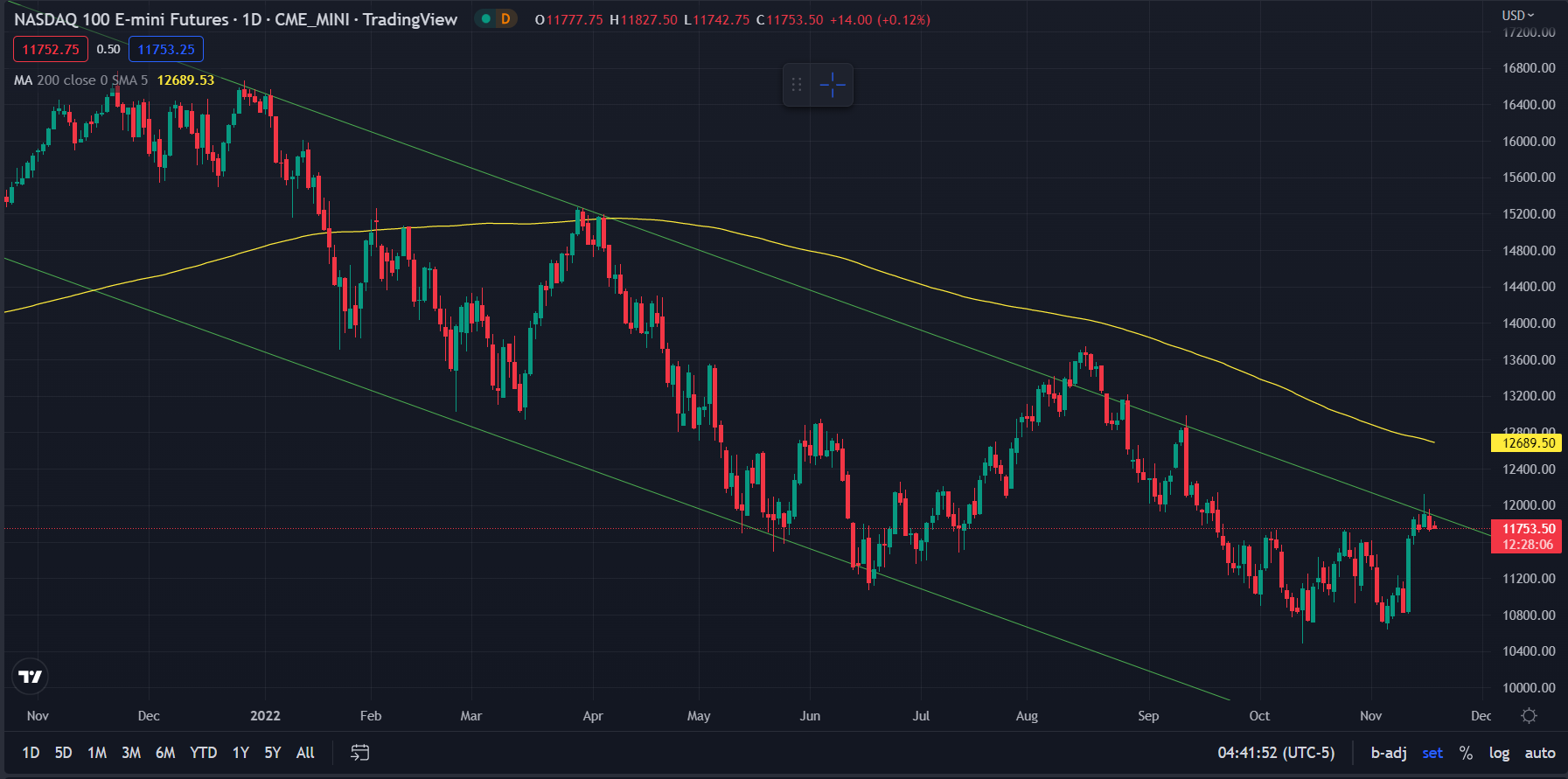
Source: Tradingview.com
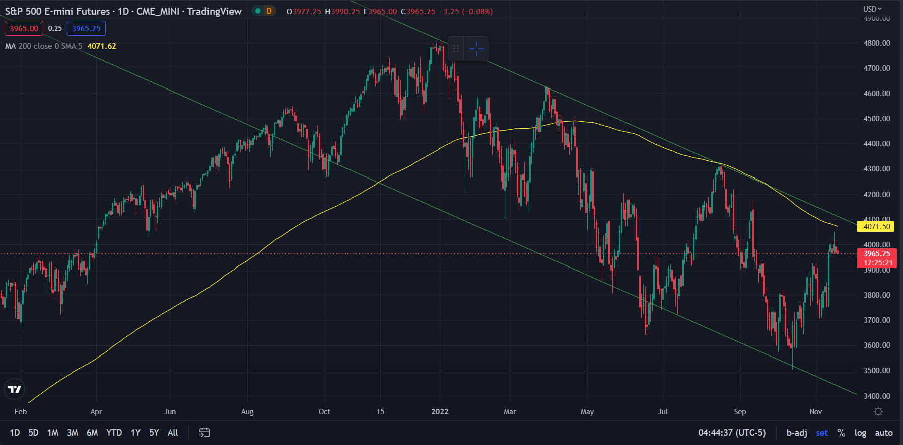
The SPX has for now not reached the equivalent level and failed to test its 200 days moving average highlighted in yellow on the below chart.
Looking at sectors, the Energy segment was the worst performer over the day dropping around 2%. Crude Oil was under pressure dropping around 1.5%.
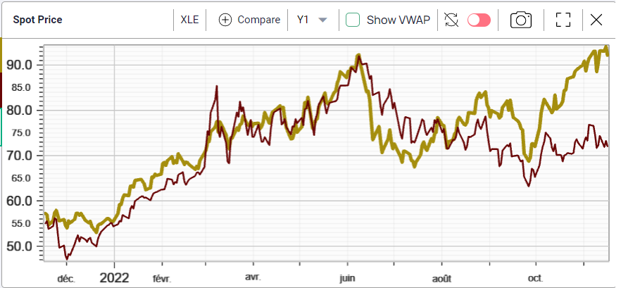
The above chart compares the last 12 months spot performance of the Energy ETF in the US with the USO. Both have slightly decorrelated and equities seem to have outperformed the underlying commodity over recent history.
The second worst performing sector over the day was found in Consumer Discretionary names losing around 1.5%.

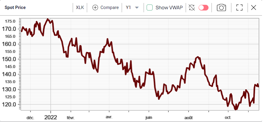
Technology stocks also slightly underperformed losing 1.4% over the session.
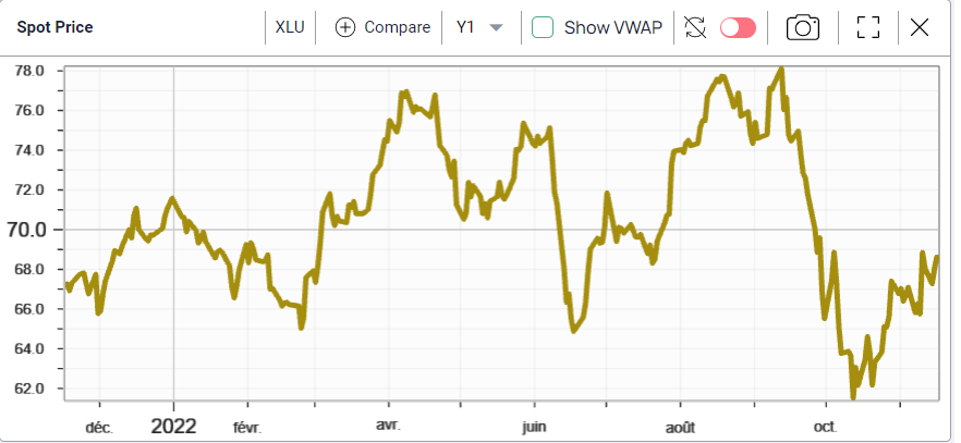
On the upside, Utilities managed to gain over the day finishing around 0.9% higher.
The second-best performing market segment was found in consumer staples which gained around 0.5%.
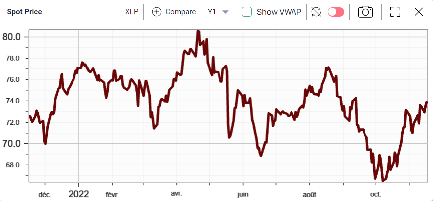
To summarize, from a spot perspective, the names that performed best, were those that have generally done better in 2022 while those that struggled were generally the underperformers. The energy segment was the notable exception to this which may be related to the moves in underlying commodity or to some form of profit taking given the stellar 61% YTD performance.
Looking at implied volatilities, we can see that, despite the move lower in spot, IVs have remained under pressure especially in the front-end with 7 days IV moving from 21% to 19.5%.
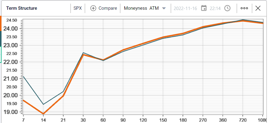
The magnitude of the move in implied volatility over the past few weeks is truly remarkable. Below, we show the SPX 20d realized volatility over the past 12 months.
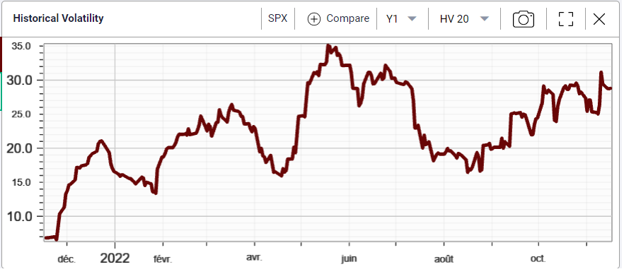
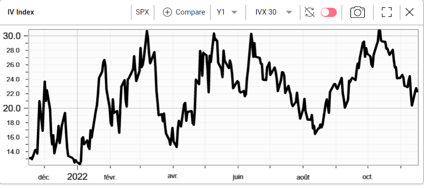
We can see that the SPX has been realizing just shy of 30% with HV increasing consistently. On the other hand, a quick look at the 30d IVX for the SPX over the past year shows how much market makers have been willing to remark implied volatilities lower on the back of spot prices moving up.
This leaves the IV Premium chart at a very low level relative to its 12 months history having just bounced off the recent lows for the past year.
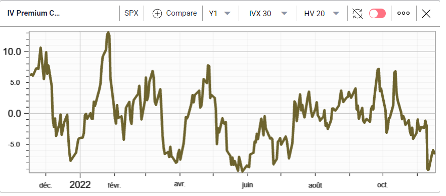
Market makers have thus priced out a lot of risk from their implied volatility curves, probably a reflection that for most, peak inflation and macro tensions are behind us. We will see over the next few months whether that approach is too optimistic or not.