We offer multiple professional grade services to help you gain insight on volatility trading. Do not hesitate to try our products FOR FREE by clicking HERE |
The Market Update is a daily newsletter written by the team at iVolatility.com. Leveraging our analytics and data we are able to update you on key developments in the volatility market. To receive the Market Update directly into your inbox, please open a free account or visit our SITE where it is published every day. |
Market Update: 2022-02-28 |
Despite no apparent signs of de-escalation in the Eastern European geopolitical tensions, markets continued to rebound led first by European headline indices closing Friday up more than 3.5% and with 30d implied volatilities down more than 5 points. |
In the United States, the NDX finished the day up 1.5% the NDX and almost 2.5% for the SPX and 30d IVs finished around 2 points lower. All 11 US sectors finished the day in the green and 30d IVs deflated by a few points across the board. |
Looking into the DOW index, we find that while all 30 components finished the day higher, not all were equal in relation to changes in 30d implied volatilities. AAPL for instance, a name that we have mentioned on multiple occasions in previous market updates, saw its 30d IVX finish only 1 point lower while its underlying spot price closed almost 1.5% higher. |
At the same time, stocks like HD, BA or CAT which all traded between 1% and 1.5% higher saw their 30d IVX decrease by around 4 points. |
As we discussed in previous market updates, when the attention is largely focused on macro related themes, single stock traders are able to find some attractive dislocations and take advantage of them. |
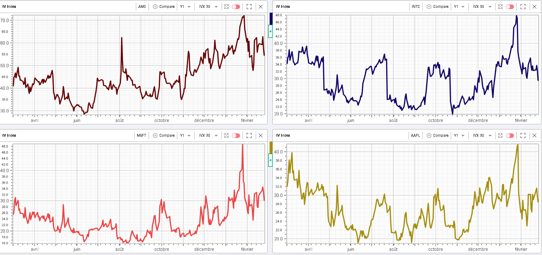
The following chart for instance shows in order of appearance, AMD 30d IVX, INTC 30d IVX, MSFT 30d IVX and AAPL 30d IVX over the last year. |
|
Some dislocations are visible with for instance an implied volatility in INTC that has dropped from its highs a lot faster than IV in AMD has. In AAPL, 30d IVX is trading at levels far below where they were 12 months ago while in MSFT 30d implied volatility is pretty much around the same level as 1 year ago. |
Knowing if those dislocations present trading opportunities requires further analysis in particular at the company level in order to assess if the level of risk priced in by market participants is excessive or insufficient. |
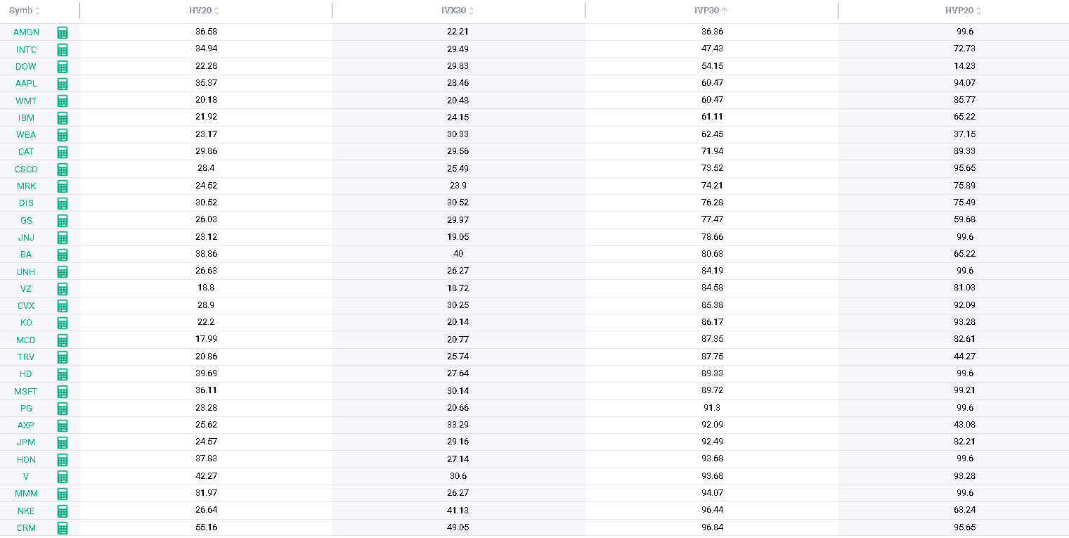
As usual, we leverage the capabilities of the Stock Monitor in order to quickly understand how implied volatilities rank relative to their own history. This is the central concept of implied volatility percentile which tells us how frequently over the last 12 months, the 30d IVX (or any other period available in IVOLLIVE) traded below the current level. |
I generally like to combine that metric with the HVP, the historical volatility percentile allowing us to understand the position of the current 20 days historical volatility of a stock relative to its own history. |
The following table from the Stock Monitor of IVOLLIVE shows both metrics in parallel and allows us to make some observations on the 4 stocks we looked at before: |
|
|
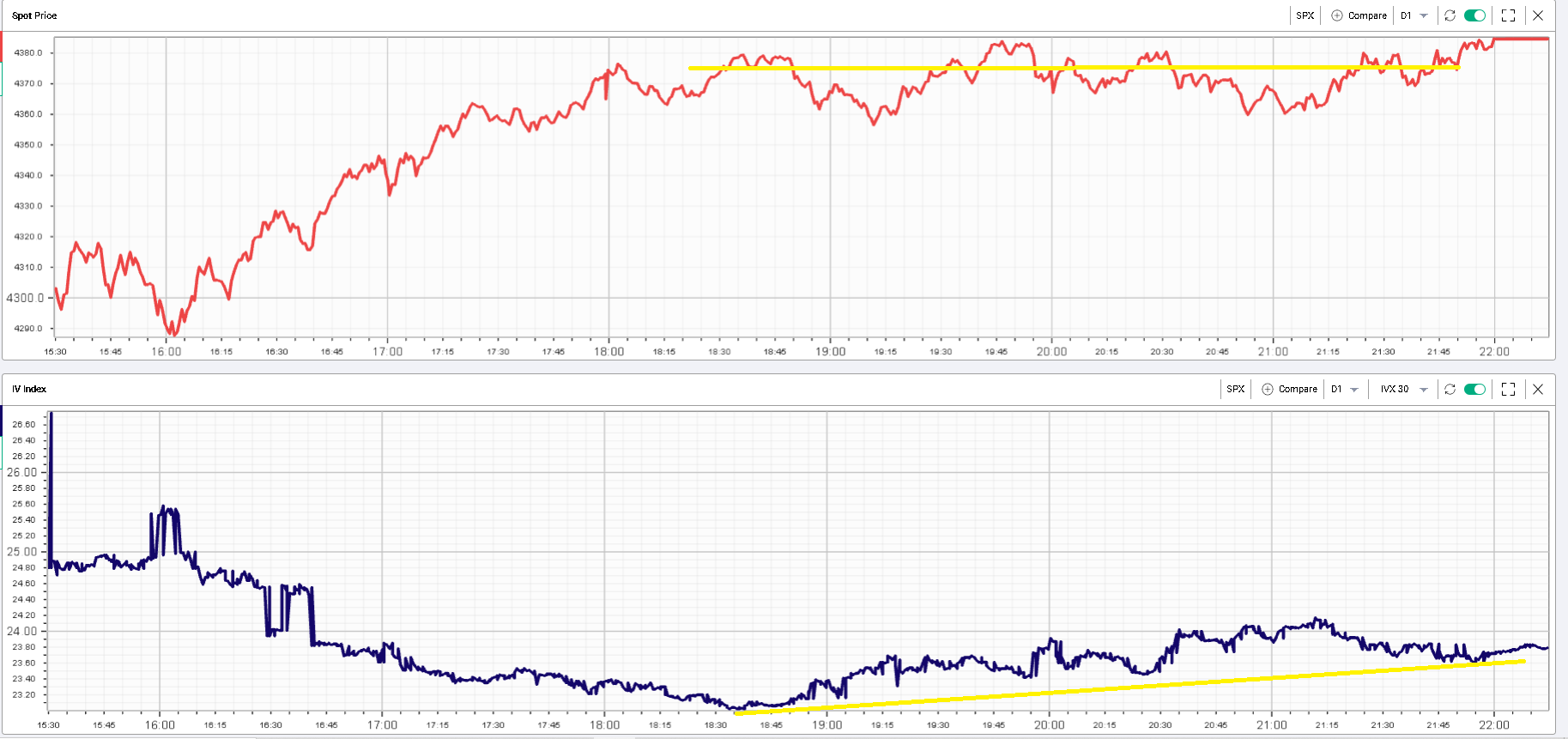
Looking back at Friday, the volatility market showed a late day divergence with spot shown on the below with in red the SPX index value and in blue the 30d IVX for the SPX. |
|
We can see that around 12.30am, the SPX 30d IVX made a low point while the spot was trading around its previous highs. The index then spent the rest of the day around the highs but implied volatilities started to go back up and gained around 0.6 point while spot finished the day at the highs. |
The NDX showed a slightly different picture into the close although 30d IVX bounced off its lows while spot closed at the highs, the implied volatility did not manage to gain as much as the SPX’s IV. |
|
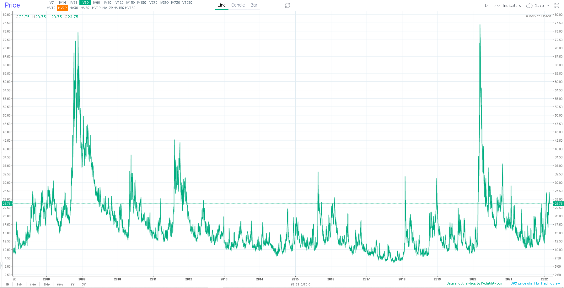
Overall, the level of worry in the market remains very elevated but has not reached any form of panic for now, at least not from what can be seen on a long-term chart of the 30d implied volatility on the SPX. Vols have been creeping higher for the last 2/3 quarters, in a trend that we have frequently highlighted in the market updates but remains far off levels reached during moments of panic and total uncertainty about the future. |
|
| Disclaimer - This information is provided for general information and marketing purposes only. The content of the presentation does not constitute investment advice or a recommendation. IVolatility.com and its partners do not guarantee that this information is error free. The data shown in this presentation are not necessarily real time data. IVolatility.com and its partners will not be liable for any loss or damage, including without limitation, any loss of profit, which may arise directly or indirectly from the use or reliance on the information. When trading, you should consider whether you can afford to take the high risk of losing your money. You should not make decisions that are only based on the information provided in this video. Please be aware that information and research based on historical data or performance do not guarantee future performance or results. Past performance is not necessarily indicative of future results, and any person acting on this information does so entirely at their own risk. |