What history tells us about Friday’s selloff |
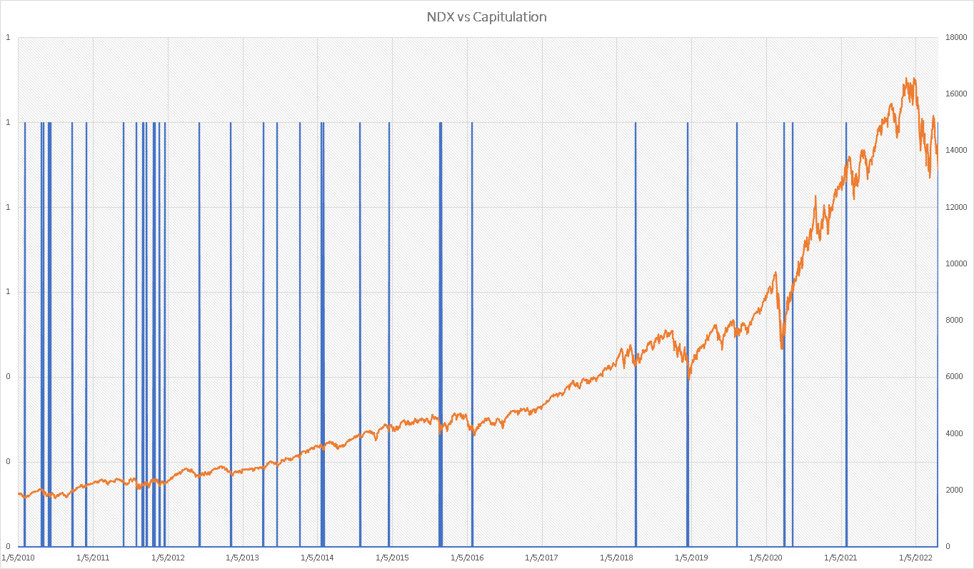
Equities sold off heavily on Friday in an almost indiscriminate fashion that looked like capitulation and hedging of positions. We noted over the past few months the difference in performance between the NDX, the DJIA and the SPX. Friday was fairly different and rare with the DJIA down 2.82%, the NDX down 2.65% and the SPX down 2.77%. |
Looking at cases historically where the NDX moved more than 2% and was less than 0.3% away from the SPX and the DJIA at the close, we find only 37 occurrences since Jan 2010. |
|
We find that in 61% of those occasions, the NDX finished higher 5 days later by an average of 3.06% while in 39% of the cases it finished lower by an average of 2.68%.This gives an average performance of around 0.83% with a maximum gain realized of 9.93% for a maximum loss of 8.51%. |
Since 2020, there were only 3 such occasions and all concluded with a gain 5 days later for the NDX: 5.25% in January 2021, 2.04% in May 2020 and 9.93% in January 2020. As with all things past performance is no guide to future performance but the idea that this sort of move could represent a capitulation in the market is worth bearing in mind. |
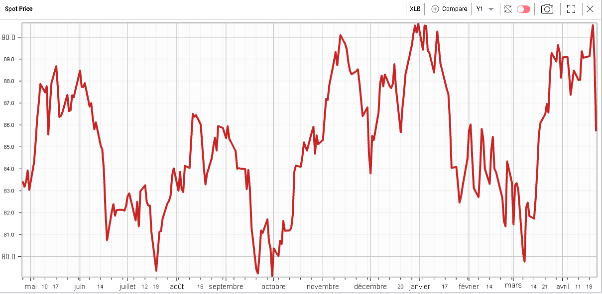
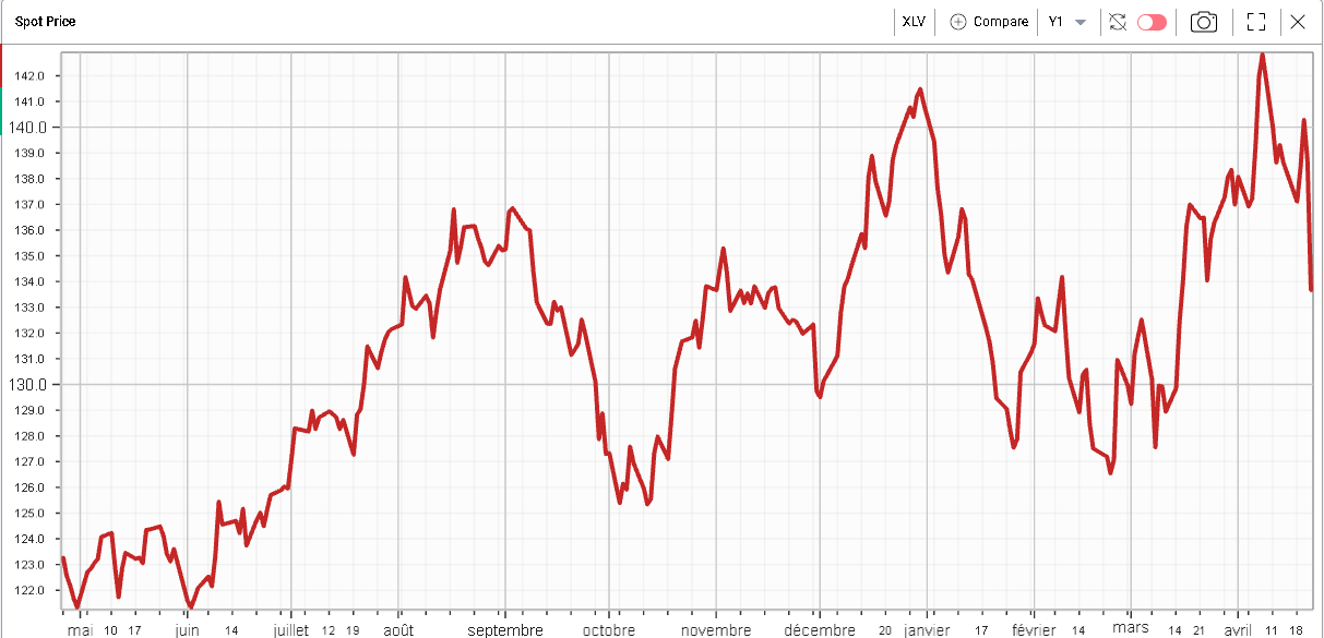
| Looking at sectors we find a relatively uniform performance with all sectors finishing in the red. Materials were the worst performing sector on the day closing 3.74% lower. Healthcare also dropped heavily closing 3.65% lower on the day. |
Those sectors are interesting because they had been performing fairly strongly and had generally benefited from the recent sector rotation that took place in the market. |
12 months performance of the Materials sector |
12 months performance of the Healthcare sector |
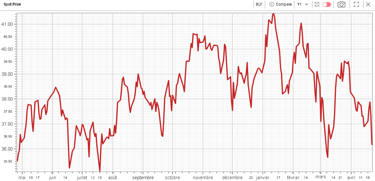
This is quite different from the performance of the Financials which have been struggling so far this year and seem to continue to do so. |
12 months performance of the Financials sector |
At the single stock level, CAT underperformed meaningfully after showing a relatively strong performance in the first half of the week and in 2022 overall. The stock closed 6.55% lower. |
|
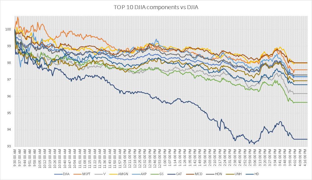
Looking at the performance of the top 10 components of the DJIA on Friday and comparing them intraday with the performance of the DJIA itself, we can see how closely correlated moves were. |
|
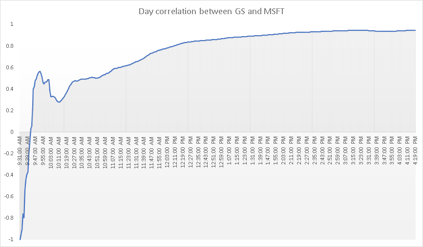
Looking for instance at the day’s correlation between MSFT and GS, we can see that relationship build throughout the day to finish around 95%. |
|
All those signs point towards a move that was less driven by single stock specific stories but rather by some form of macro hedging and risk reduction that seems to have been implemented via indices. |
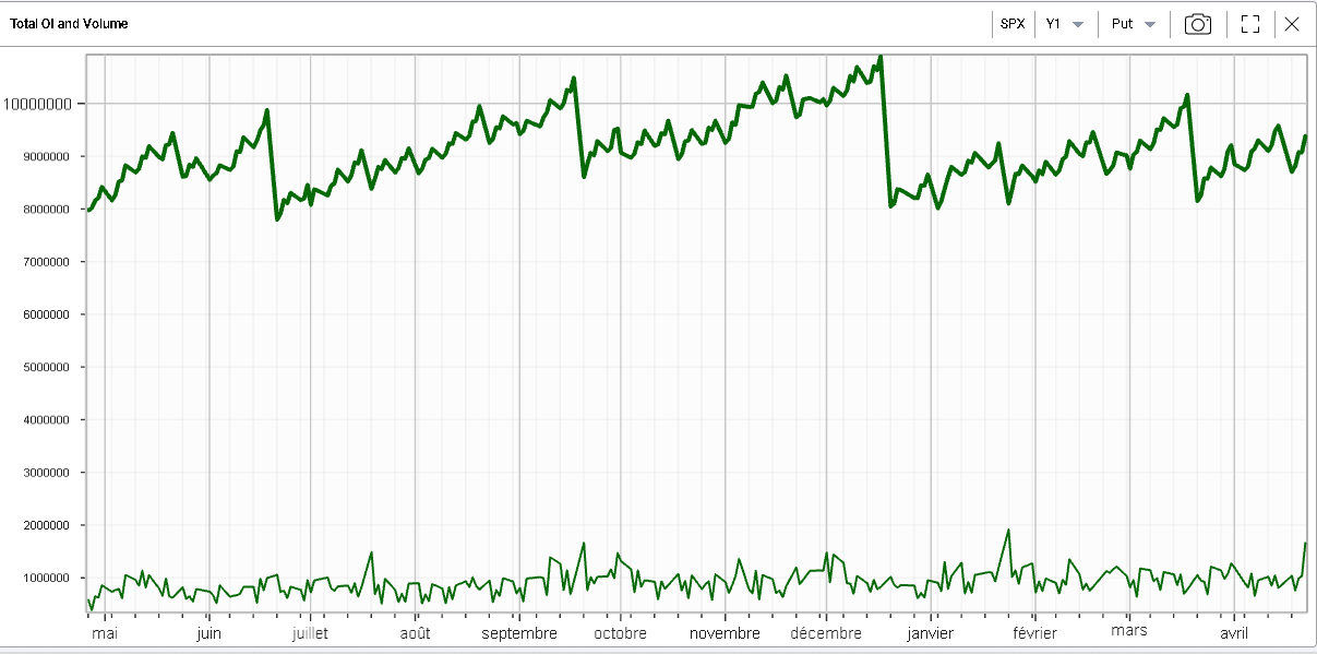
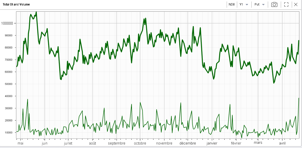
This is also visible when we look at the volumes for puts on the SPX and the NDX which pretty much reached their highest levels in 12 months. |
12 months OI (top) and volume (bottom) for SPX puts |
12 months OI (top) and volume (bottom) for NDX puts |
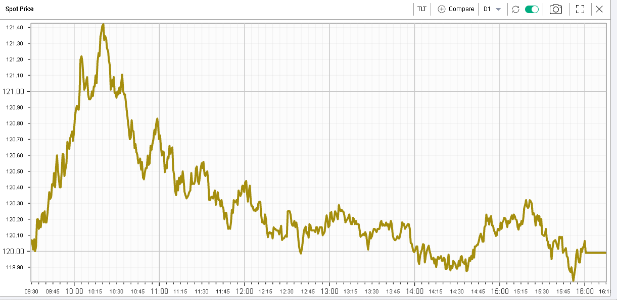
Looking at the financial press, very few explanations were given for this move. Rates do matter obviously but Friday was fairly calm on that side with the 10-year trading around 2.9%. The chart below of TLT over the trading session shows how quiet things were in Fixed Income. |
|
It is possible that investors are pairing their exposures as the market gets closer to the May FOMC meeting on the 4th May’22 ie in less than 2 weeks now. |
The rhetoric from the FED has been unequivocally hawkish over the past few weeks and the May meeting is seen as pivotal with a possible 50 basis points hike that was also discussed by Fed Powell last week. This meeting will also mark the beginning of the reduction of the Fed’s balance sheet. |
Looking at volatility on the NDX for instance with the 90d skew below, we can see that we shift higher by around 3 points on the week. In green we show the curve as of the 14th Apr’22 and in orange the curve as of last Friday. |
|
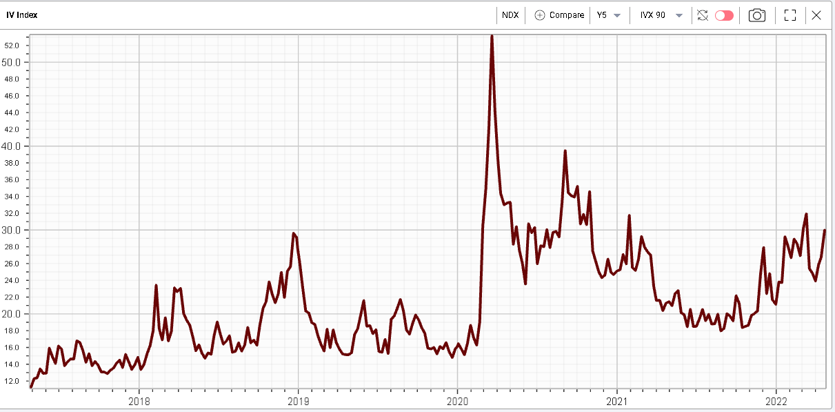
Historically we can see that the NDX 90d IVX has started to move higher and is fast approaching the highs seen at the start of Mar’22. |
|
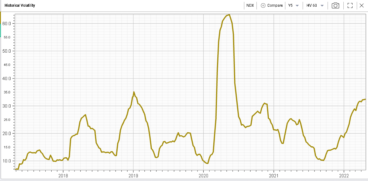
Meanwhile, realized volatility measured here with the 60d HV, continues to grind higher and is now above 30%. |
|
Disclaimer - This information is provided for general information and marketing purposes only. The content of the presentation does not constitute investment advice or a recommendation. IVolatility.com and its partners do not guarantee that this information is error free. The data shown in this presentation are not necessarily real time data. IVolatility.com and its partners will not be liable for any loss or damage, including without limitation, any loss of profit, which may arise directly or indirectly from the use or reliance on the information. When trading, you should consider whether you can afford to take the high risk of losing your money. You should not make decisions that are only based on the information provided in this video. Please be aware that information and research based on historical data or performance do not guarantee future performance or results. Past performance is not necessarily indicative of future results, and any person acting on this information does so entirely at their own risk. |