Three things you can do with our newest product IV Difference |
We have just released our latest upgrade to Charts called IV Difference. This is a true game changer as it will let you tap into our powerful database to find your own trading opportunities. |
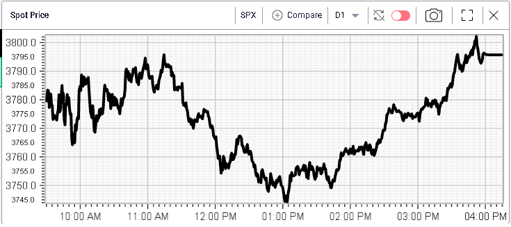
First, let us quickly look at what happened in markets yesterday. US indices continued to advance and settled in green, respectively, +0.95% for the SPX, +1.47% for the NDX and +0.64% for the DJIA. Looking at the intraday spot price for yesterday, we can see that we are still not sailing smoothly as the SPX sold off 50 points in the space of 2 hours around lunchtime before rallying back towards the highs at the close. |
|
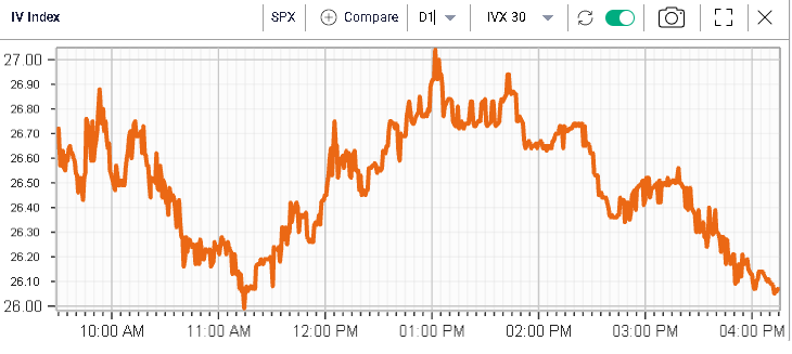
Implied volatilities traded around roughly in line with spot prices and settled around 26 for 30d IVX on the SPX. |
|
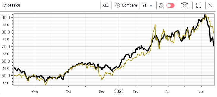
In terms of sectors, energy continued to selloff losing almost 4% on the day. The sector is being hit by two factors. First, the remarks by the American President are making traders nervous about a possible change in regulation. Second, energy prices remain under pressure with the Oil price down 15% since mid-June. This backdrop probably makes it harder for investors and traders to hold onto longs. The chart below shows 12 months of historical spot prices for the Energy sector in black compared with the USO in yellow. |
|
Materials also underperformed losing around 1.4% on the day while on the upside, staples, utilities and healthcare performed relatively well gaining around 2%. |
Over in Europe, the weak macro backdrop is getting more and more traders worried that a recession is on the cards for the end of 2022 or early 2023. The German DAX lost 1.76% while the French CAC outperformed and finished 0.6% in the red. The moves were fairly violent with DBK losing 12% or BMW dropping almost 5%. |
Let us now get back to IV Difference and discuss three types of analysis that can be performed with this newly released service. |
|
We have just discussed how European assets felt heavier than their US counterparts yesterday. Looking at it through the prism of volatility can be helpful to understand if opportunities lie in that space as well. The IV Difference chart offers some tremendous help in order to achieve this result by allowing our customers to compare the implied volatility of any underlying asset with another and look at it historically. Furthermore, this is offered on the entire surface that we fit on each of the underlying stocks/etfs and indices that we cover. |
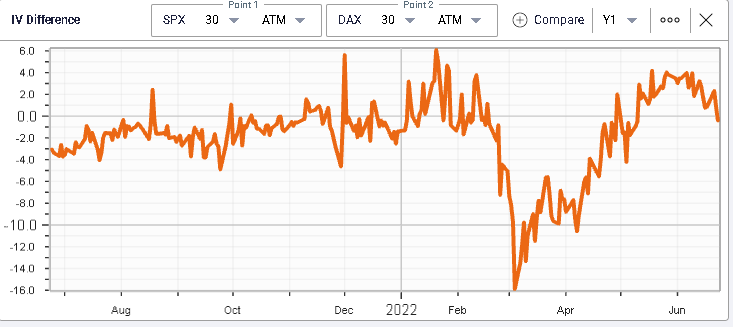
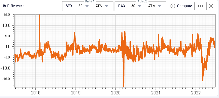
In the example below, we look at the 30d ATM IV difference between the SPX and the German DAX over the past year. |
|
We can see here that the spread has been within a -16/+6 range over the past year and that it recently pretty much went back to its highs. It has now turned back lower and is around flat as we speak. |
Our service allows you to retrieve up to 20 years of data (depending on the underliers) when doing your comparisons letting you tap into our powerful historical database to help you get the information you need for your trading decisions. |
The same spread over the last 5 years shows that, for the SPX to trade at a premium in terms of IV to the DAX is an unusual event. |
|
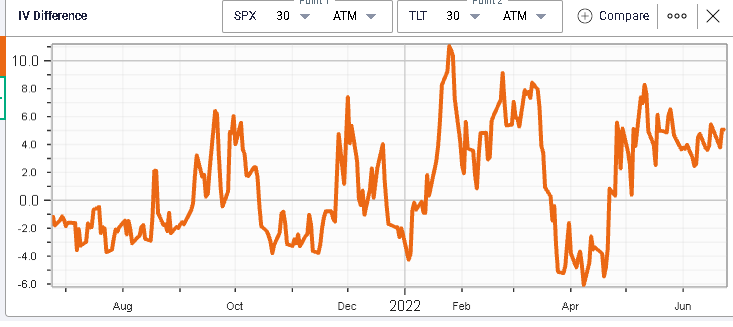
This can also help you located opportunities by using leading indicators. For instance, we have flagged in the market update how Fixed Income volatility had acted as a leader to Equity volatility. The below chart displays 12 months of the 30d ATM IV spread between the SPX and TLT. If we look at the April period when the SPX was rallying and implied volatilities were collapsing, we see that the spread reached a low point of around -6, a very unusual setting for that spread. |
|
That simple signal would have allowed traders to pick the lows in implied volatility for the SPX as shown on the below chart. |
|
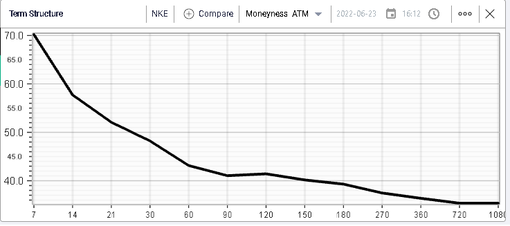
|
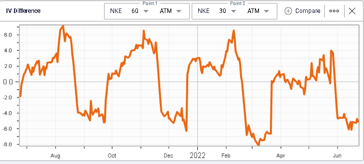
Implied volatilities are not constant through time and as such, the market will assign different values to the volatility of options with different maturities. This is what the term structure chart displays as we show below with, in this case for NKE, short dated options trading with much higher implied volatilities than longer dated options. |
|
The divergence between the implied volatilities of options from different maturities can create opportunities and help you make informed decisions when selecting a specific maturity to trade. |
In the example above, a trader who may have wanted to buy a 30d option on NKE may consider rolling this to a 60d option given the 3 points discount that could be achieved. Looking at this through the prism of history, we get the below chart, displaying the 60d IV - 30d IV spread for NKE. |
|
This chart shows that in historical context, the current discount offered on 60 days options relative to 30 days options looks high. This is a 12 months chart only and there are reasons for such a discount but it is still important to get a clear picture of the relative position of those parameters to help you make your trading decision. |
|
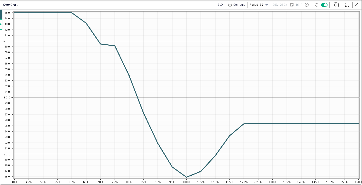
In options trading, not all strikes are created equal and some are going to be more expensive than others depending on the asset that you are looking at. This is what we call Skew Chart and we display below an example on 30d GLD options. |
|
We can see that the implied volatility of the options with strike 100% is very different from that of options with strike 85% or even 110%. |
This is important to consider for a trader, as he will need to assess whether the difference that is being witnessed looks high or low relative to history. |
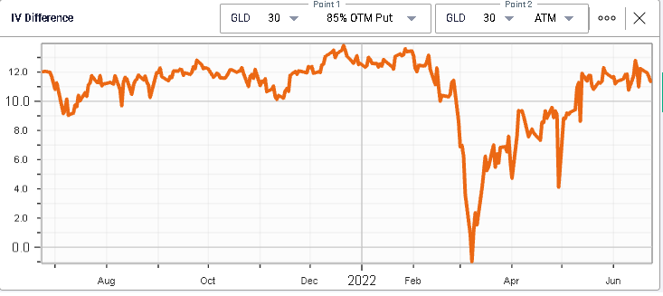
For instance, we plot below the difference between the 85% puts on GLD and the ATM puts on GLD. |
|
We can see that the difference is now trading around +11.4 which looks high relative to recent history but looks in line with what was seen prior to 2022. In other words, if the trader is looking to acquire a put in GLD, looking at the ATM puts instead of the 85% puts means saving 11.4 points on the volatility cost he is paying through the options. |
There are plenty more things we can do with IV Difference and we will display more of those in the coming weeks via our market update, freely available on: https://www.ivolatility.com/news.j |
If you want to test our products, do note that we offer a free 3 weeks trial and if you need assistance getting setup with the platform, feel free to write to us at support@ivolatility.com. |
Disclaimer - This information is provided for general information and marketing purposes only. The content of the presentation does not constitute investment advice or a recommendation. IVolatility.com and its partners do not guarantee that this information is error free. The data shown in this presentation are not necessarily real time data. IVolatility.com and its partners will not be liable for any loss or damage, including without limitation, any loss of profit, which may arise directly or indirectly from the use or reliance on the information. When trading, you should consider whether you can afford to take the high risk of losing your money. You should not make decisions that are only based on the information provided in this video. Please be aware that information and research based on historical data or performance do not guarantee future performance or results. Past performance is not necessarily indicative of future results, and any person acting on this information does so entirely at their own risk. |