Market holds the key 3750 for now
July 18, 2022
Over the course of the week, the SPX dropped 0.9%, the NDX dropped 1.15% and the DJIA was pretty much unchanged.
Technically, the SPX remains in a downtrend on the daily timeframe but the key level of 3750 highlighted last week held despite being under significant pressure from bears. As long as 3750 is preserved, bulls will probably keep faith in the momentum that is building and quickly aim for a test of 3950, the previous local highs that stalled their advance.
Source: Tradingview.com
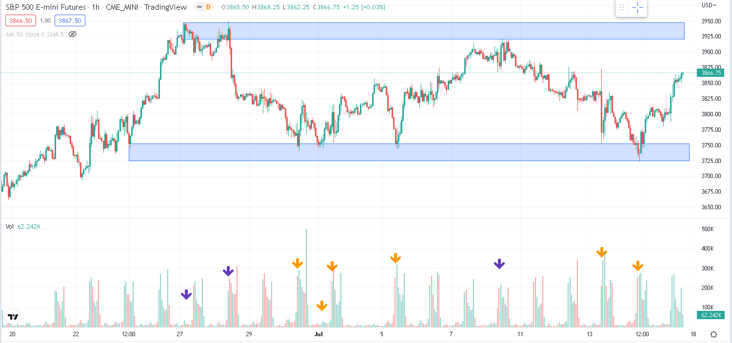
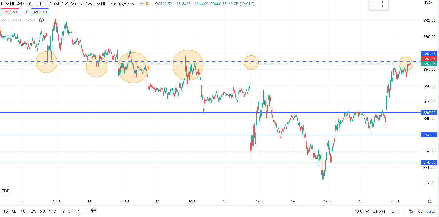
Looking at the hourly chart over the past month, we can see clearly the significance of those two areas, identified here as the 3725-3750 zone and the 3925-3950 zone.
Source: Tradingview.com
On the volume sub chart, we flag in orange the volumes on which the market tested the bottom part of the range while in purple we show the volumes on which the market tested the upper part of the range.
Volumes are the key validator of a level and the 3725-3750 has acquired a lot of strength over the past few weeks. This being said, it also means that bulls have had to commit a lot of capital in order to defend the level.
Using SPY volumes, we get the following volume per price histogram. In terms of comparison, the 3925-3950 area is roughly equivalent to 385-387 on SPY and the zone 3750-3740 would be around 373-372.
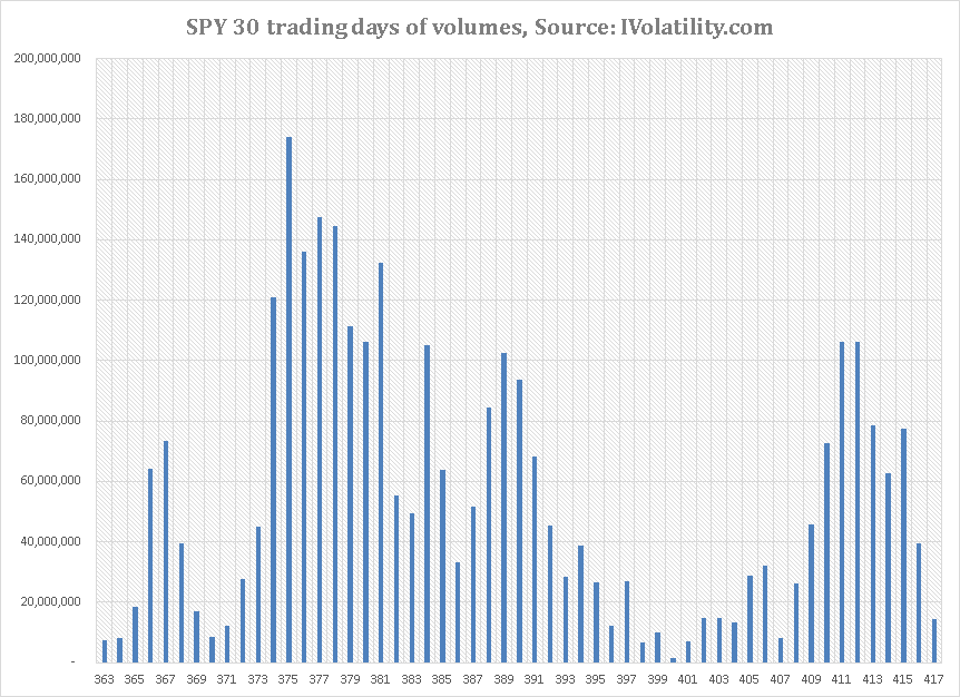
Looking at the above, we can really see that an intense battle was fought around the 373-375 area and that much less happened at the upper end of the range.
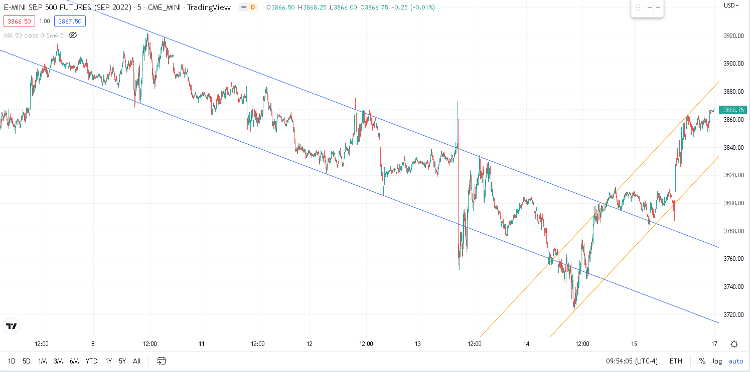
Zooming in onto the specific developments observed last week, we can see that the week was split into two consecutive sections. First in blue, we highlight the downtrend that prevailed until the open on Thursday. Second in orange, we show the uptrend that started from Thursday and remained in play until Friday‚s close.
Source: Tradingview.com
Looking at this chart and keeping in mind the strong performance observed the prior week, it is entirely possible that a lot of people had accumulated positions and found themselves willing to reduce their exposures as the new week started ahead of the CPI figures that many feared would trigger a new round of volatile markets. The selloff was pretty clean until the CPI figures which seemed to give a renewed confidence to bears who started to be more aggressive. With the 3740-3750 zone in reach, they managed to get stops triggered below that zone but were then met with some renewed buying.
The most significant level for the week outside of 3740 was probably the one where we stopped on Friday namely 3870. We highlight on the chart below the various tests, first as a support and then as a resistance that were made at this key point.
Source: Tradingview.com
Despite headline performance looking fairly small, under the surface some very large moves happened. Let us look quickly at some of the themes played by the market over the week.
- Financials profitability and credit risk in focus
With the earnings season under way, traders looked into the results of some of the largest global financial institutions. Big names like Morgan Stanley, JP Morgan or BlackRock missed numbers and the market reflected this across the entire sector.
Furthermore, in Italy, former ECB President Mario Draghi‚s government seems to be on the brink of collapse with the risk of political instability in Europe adding to fears. This weighted on European Banks last week.
Not everything was disappointing in the space with Citigroup managing to significantly outperform the market‚s expectations and the stock gained more than 13% on Friday. For now, in the US, it seems that traders are still looking at Financials on a case-by-case basis and evaluating the individual performances of banks while in Europe, the broader sector was under some intense pressure losing 7% over the week.
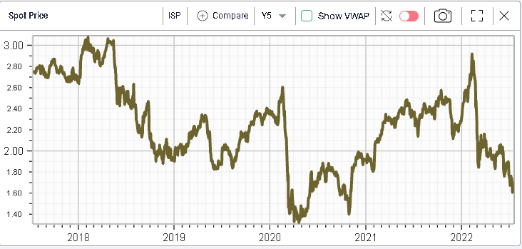
Over the week, French Bank BNP dropped 8.5%, Dutch ING dropped 8.7% and Italian ISP lost 7.3%.
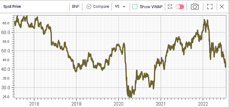
The way volatility evolved over the week in BNP is quite telling of the worries that have been priced in by market participants. The green line below represents the implied volatility as of Friday‚s close while the red one represents the same implied volatilities as of the 8th July.
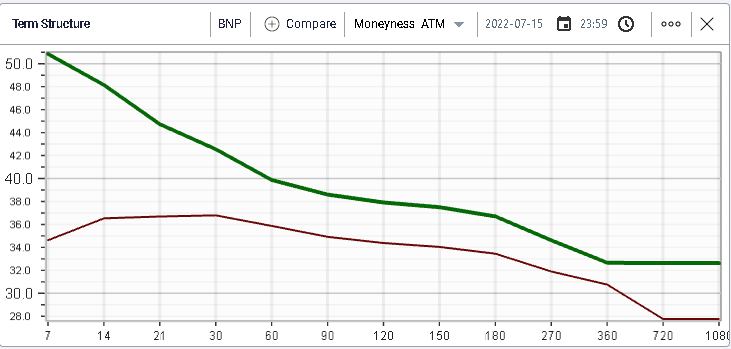
Looking more specifically at 30 days implied volatility, we get the following 30d IVX historical values for BNP.

Implied volatilities have been drifting higher but remain far off the panic level seen as the Russian invasion of Ukraine started.
- Will the FOMC meeting really deliver a 1% hike next week?
Following the very large print in CPI this week at 9.1% annualized in June, some market participants have started to postulate that the FED might raise rates by as much as 1% at the next FOMC meeting although some FED members have, according to media reports, started to voice concerns about such a prospect including Bostic, Waller and Bullard.
Irrespective of the size of the rate hike, economists have now firmly converged towards the notion that a meaningful slowdown in the economy is getting more likely than not towards the end of this year or the beginning of next.
They explain that, there is a need for central banks to control inflation while it is in its early stages. Once it is engrained in individual and firms‚ mindsets, it becomes much harder to control and the costs associated rise.
In the first few stages, the population finds itself with too much money allowing it to chase prices for goods and services. In the current situation, we also need to consider some supply driven inflation linked to the backlog of orders, slowdown in the Chinese production and disruption in the availability of some commodities. Firms are thus able to increase prices while possibly raising their margins. This only lasts a short while.
In the second phase, as consumers start to deplete their excess cash, they realize that their purchasing power has been eroded and request wage increases. Combined with very low unemployment and a high rate of job openings and workers have the upper hand forcing companies to raise salaries.
This is one of the more important feedback loops of inflation. Expectations also play a key role in this environment. Once the population has been exposed to a certain degree of inflation for a prolonged period, it might start to extrapolate that inflation creating a risk of a self-sustained inflationary environment. The more you expect inflation to be, the more you will expect prices to rise in the future and as a result, the more likely you are to frontload your purchases creating the perfect conditions for prices to rise. Some companies or even individuals might even start to borrow in order to acquire products and goods today that they are sure will rise in value in the future.
The FED, as it fixes interest rates (the cost of money) can at least partly influence the amount of money in circulation thus limiting the effects described above. By restraining demand, it helps limit the imbalance between buyers and sellers and can restore a more orderly situation. This is all fine and well in theory but as with all things, it is not easy to find such a delicate balance and Central Bankers always run the risk of doing too little or too much although many have argued that in the current situation, the risk of doing too little significantly outweigh the risk of doing too much.
As we saw on Thursday following the CPI numbers, some of the equity market reaction‚s might well be surprising in the coming week. Since 2009, traders had been used to the notion that bad news was actually good news. At first, this seemed very counterintuitive but people quickly realized that the FED was inevitably poised to do more in order to support the economy which would then have a distorted effect on Equity markets. It will thus be interesting to see how the market narrative evolves as more economic numbers are released leading up to the FOMC at the end of the month.
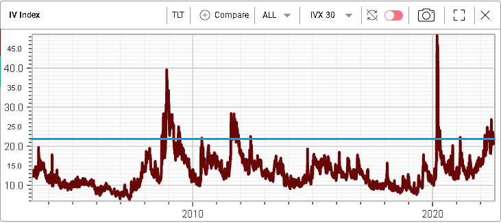
Fixed Income traders are gearing up for more volatility over the next few weeks as evidenced on the below long-term chart of TLT 30d IVX showing how the current implied volatility regime for the ETF has only been reached and sustained on 3 occasions before since 2003:
- The Global Financial Crisis (2008-2009)
- The 2011 Government Shutdown crisis
- The COVID pandemic